Anti-Parris Pie Charts
Pie charts graphically present information in the form of a circle divided into segments showing their relative sizes.
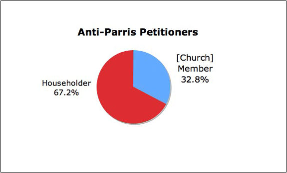
To compare anti-Parris adult householders with those who were church members, use the data in the edited anti-Parris pivot table. Open the Chart Wizard and choose "Pie." Click the "Data Range" icon and drag the mouse through the "[Church] Member" and "Householder" labels in the second row of the pivot table. Release the mouse, and hold down the Command key and drag through the two "Grand Total" data cells for "[Church] Member" and "Householder" in the fifth row. Release the mouse, and click the "Data Range" box to return to the Chart Wizard window. The "Rows" button should be selected, indicating "series in" rows. Click "Next" and edit the chart in the Chart Options window. Further editing can be made in the final chart image by right-clicking the labels and selecting "Format Data Labels."
The large representation of householders as compared to church members in the anti-Parris faction is evident. The same procedure can be used to construct a pie chart comparing male and female signers of the anti-Parris petition.
As in the case of the pro-Parris faction, it is especially helpful to display the relative size of all the identity categories of anti-Parris petitioners. Create a new worksheet in Excel. In the top row of cells, label the six groups of anti-Parris supporters: Female Non-Members, Female [Church] Members, Male Householders, Male [Church] Members, Male Free-Holders, and Young Men 16 Years Old. In the second row, copy the number of signers in each group from the anti-Parris pivot table.
| F [Church] Member | M [Church] Member | M Free-Holder | M Householder | F Non-Member | M Young Men |
| 11 | 6 | 5 | 29 | 16 | 17 |
Drag through the cells to select them, open the Chart Wizard, and choose "Pie": the two rows of cells are identified in the "Data Range" window. The Rows button must be selected, indicating "series in" rows. The pie chart can be edited in the Chart Options window and in the completed chart by right-clicking the labels and selecting "Format Data Labels."
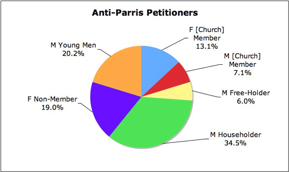
The chart vividly shows the importance of non-church members and males in the anti-Parris faction. The largest sub-group of anti-Parris supporters were male householders, who comprised 34.5% of all petitioners, significantly more than the equivalent group of pro-Parris petitioners. The next largest group of anti-Parris petitioners was that of young men, a category not found on the pro-Parris petition. Smaller in size and with a heavy concentration of non-church members, non-taxpayers, and males, the anti-Parris faction was socially distinctive compared to Parris's supporters.
To return to the Anti-Parris Report page, click Back or Next.